hMa | HANRAHAN MEYERS ARCHITECTS | DESIGN IS A FRAME TO NATURE. PROFILE | PROJECTS | NEW & IN PROGRESS | BOOKS BY hMa | LINKS |
|
juliana curran terian pratt pavilion
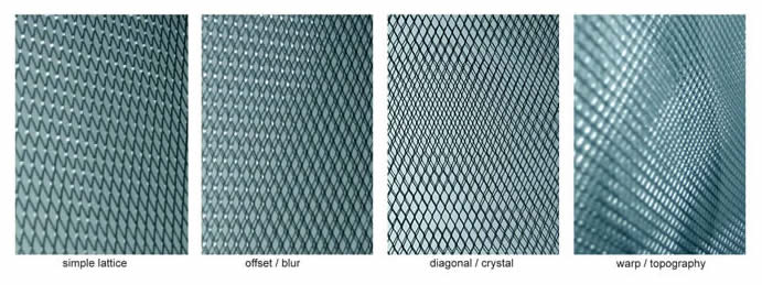
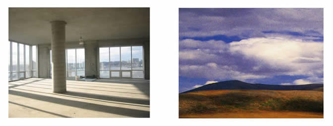
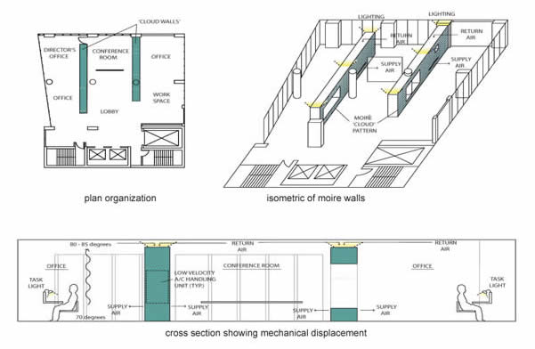
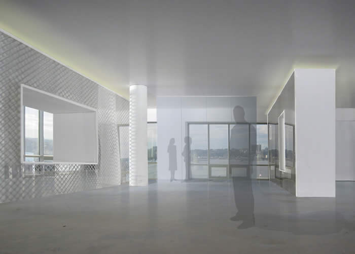
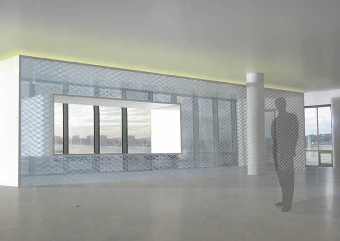
project: Joan Mitchell Foundation (proposal) In 2006, hMa created this Proposal for the design of a new headquarters for the Joan Mitchell Foundation. Design Concepts In order to exploit both the material quality of the concrete and the 11- foot ceiling heights, as well as employing the latest in sustainable design, we have developed a strategy of consolidating all of the services for the floor into two translucent volumes clad in metal screen. The volumes incorporate the air conditioning equipment and the general illumination, while allowing views and passage through strategic openings. Organizationally, the layout places the workspaces and offices around the perimeter, while the central space is reserved for conferences and a flexible lobby for daily use and special events. The volumes establish and identity for the Joan Mitchell Foundation by giving a gallery-like feeling to the workspace and demonstrating a commitment to the environment and preservation of natural resources. Joan Mitchell’s paintings, while abstract, exhibit a deep reverence for the world and our approach embraces both the experimental and observational aspects of her work. Conventional building practices for these types of spaces generally mandate that the ceilings be lowered and all the building services be placed in the remaining ceiling cavity. Not only does this approach destroy the spatial and material qualities of the offices, it is extremely wasteful from an energy perspective. Instead we propose smaller, slower speed mechanical fans installed in these two central volumes that distribute hot and cold air at the height of three feet directly from the sides of the volumes. This concept is called ‘displacement’ and is proven to reduce energy costs while enhancing comfort. We propose to light the space generally with indirect lighting from the central volumes, and again minimize disturbance to the ceiling with too many light fixtures. Lighting will be provided at the workstation level with control being given to individual employees. This approach can reduce electrical use for lighting by over 40%, and provide a softer, warmer hued work environment. We have attached concept sketches that outline our approach. Lattice patterns of metal screen or etched on glass can create moiré patterns of increasing complexity on flat surfaces, evoking the complexity of cloud formation. We also propose that all electrical and data services be consolidated into raceway elements and workstations, minimizing typical sheetrock walls. The constant construction and dismantling of gypsum partitions is an enormous source of pollution in NY, and the elimination of walls not only reduces this problem but also can provide a more open, light filled work environment. We also propose that no new permanent flooring be installed, but that a careful selection of area rugs or consolidated carpet squares is used to control the space acoustically and provide color and warmth. Workstations can incorporate wood and fabric. Therefore, the basic approach to materials is to expose the elegant visual effect of the concrete shell, and selectively use a palette of sophisticated materials such as translucent metal, glass, wood, and warm fabrics. The layered translucent metal screening and moiré effects will create an abstract, yet expressive visual surface. We believe this design approach will visibly demonstrate the positive values of the Joan Mitchell Foundation while supporting the spirit of experimentation and creativity that is central to the JMF mission.
|
|
